Cottagecore vs Dark Academia: A Supplies Guide for Both Aesthetics
You have a journal open in front of you. You want the page to feel like something specific: warm and overgrown, or dark and bookish. Those are two different directions, and the supplies that get you there are not the same. This guide is for anyone who already knows roughly which side they are drawn to, and wants to know exactly what to buy to get there.
Cottagecore and dark academia are two of the most distinct visual languages in the journaling world right now, and they have been building momentum for years. Both are rooted in the same basic preference: for old things, handmade things, and the textures of pre-digital life. A journal built around either aesthetic is immediately recognizable, whether it is covered in pressed wildflowers or filled with pages that look like manuscript annotations by candlelight.
By 2025 and into 2026, both communities have grown large enough to support their own supply markets and their own distinct approaches to what a journal should feel like. This guide lays out what each aesthetic actually requires, where the practical differences are, and where the two overlap more than most people expect.
 ►
►
What Makes Cottagecore, Cottagecore
The visual language of cottagecore is rooted in the English and Northern European countryside, filtered through a kind of nostalgic idealism. The recurring imagery includes mushrooms, wildflowers, soft sage and cream tones, pastoral scenes, old stone farmhouses, honeybees, pressed plant illustrations, and wooden textures. These are not random choices. Each element connects back to the same underlying idea: that daily life close to the natural world is more nourishing than modern urban routine.

The emotional register that cottagecore aims for is slowness, domestic pleasure, and closeness to nature. It rejects the pace and aesthetic of cities. A cottagecore journal page is not in a hurry. It is built to look like something you found pressed inside an old book, or something you assembled over a rainy afternoon at a kitchen table surrounded by dried herbs and garden cuttings.
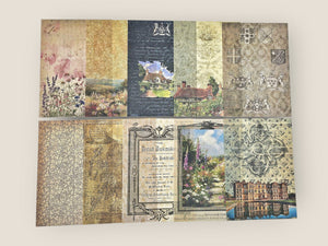
In journaling terms, the cottagecore aesthetic translates to warm-toned pages, earthy color palettes, botanical layering, nature prints, and linen-like textures. The palette runs from ivory and warm cream through dusty sage, rose, amber, and soft brown. The illustrations that fit best are the kind you would find in an old field guide: detailed, naturalistic, slightly aged in tone.
One thing worth getting right early: cottagecore is not precious or sentimental in the way that "cute" crafting can be. The best cottagecore journals look weathered and genuinely used. They look like they grew organically rather than being planned out in advance. The mushrooms and botanicals work because they have a slightly wild quality to them, not because they are perfectly symmetrical or brightly colored. If your pages look lived-in and slightly imperfect, you are on the right track.
Cottagecore Supplies: What to Buy
Washi tape does a lot of work in cottagecore journals. A single strip of mushroom-print tape along a page border immediately sets the mood. The Vintage Mushrooms Washi Tape ($10) does this reliably: the print is detailed enough to read clearly at the scale of a journal page, and the color palette stays in the warm brown and cream range that anchors cottagecore spreads without competing with everything else on the page. The Enchanted Forest Foil Washi Tape ($11) adds a different texture to the same palette. The foil catches the light, giving the forest imagery a faintly magical quality that suits journalers who want to lean into the fairytale side of the aesthetic.

Vintage Mushrooms Washi Tape ($10): detailed mushroom and botanical print in warm earth tones
 ►
►
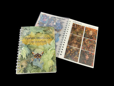
For sticker collections, look for soft color palettes, nature motifs, and illustration styles that reference vintage botanical prints or old field guide drawings rather than modern cartoon art. The Mystical Woodlands Sticker Book ($25) covers this well: it includes mushrooms, forest creatures, plants, and woodland scene elements, all drawn in a style that sits between naturalistic illustration and fairy tale. The Herbal Magic Sticker Tin Box ($16) takes a more apothecary direction, with herbs, dried botanicals, and hand-labelled elements that work well on pages where you want a slightly more scholarly, less purely pastoral feel.

Secret Garden Washi Tape ($10): climbing botanicals and garden imagery in soft, muted tones

Wooden stamps add a handmade texture that digital stickers cannot replicate. A stamped image has slight ink variations, irregular edges, and a physical presence that looks distinctly hand-crafted. The Lady of the Forest Wooden Stamp ($12.50) brings a figurative element into the mix. Stamped in brown or forest green ink on cream or ivory paper, it gives a page a narrative center without needing to layer much around it. Wooden stamps also age well with use, and the slight inconsistency between stampings suits the cottagecore aesthetic rather than working against it.
Start Your Cottagecore Collection
These are the pieces that build a recognizable cottagecore spread from the first page: mushroom and botanical washi for borders, woodland stickers for layering, and a figurative stamp for pages that need a focal point.
Craft finds and free printables
Washi tape picks, seasonal printables, and journal prompts worth keeping. One email, whenever there's something worth sending.
You're in. Your first picks are headed to your inbox.
What Makes Dark Academia, Dark Academia
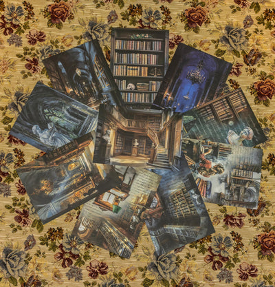
Dark academia draws its visual language from 19th century European scholarship: dark wood paneling, old leather-bound books, candlelight falling across manuscripts, classical architecture like stone columns and library arches, apothecary bottles arranged on shelves, handwritten annotations filling the margins of printed pages, worn maps, and constellation charts. The overall atmosphere is one of serious intellectual life conducted in beautiful, aged spaces.
The emotional register is more specific than it might first appear. It is not simply "dark" in the gothic horror sense, though it shares some imagery with that tradition. It is more accurately described as the melancholy pleasures of scholarship: the feeling of staying up late with a difficult book, the accumulation of knowledge that comes with years of study, the atmosphere of libraries and laboratories where important work has been done over many decades. There is a kind of intellectual longing to it. Twilight and lamplight appear repeatedly because they are the natural lighting conditions of someone who reads too much.
In journaling, this translates to dark-toned pages, aged effects, and deep color palettes dominated by charcoal, deep forest green, dark brown, and aged parchment tones. The illustration style leans toward classical: anatomical drawings, celestial maps, alchemical diagrams, architectural sketches, and the kind of dense, marginal annotation you see in old scholarly manuscripts. The physical journal itself matters more in dark academia than in most other aesthetics.
There are recognizable subsets within the broader dark academia category. The celestial direction focuses on constellation maps, night sky imagery, and astronomical instruments. The gothic direction brings in architectural elements like arches and flying buttresses, ravens, candelabras, and dramatic shadows. The apothecary direction centers on vintage medicine, botanical specimens in glass jars, hand-labeled containers, and the meeting point between natural science and pre-modern occultism. All three share the same deep color palette and scholarly atmosphere, drawing on different image libraries.

Dark Academia Sticker Book ($25): scholarly and gothic motifs in deep, muted tones
Dark Academia Supplies: What to Buy
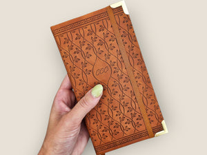
In dark academia, the notebook itself carries more aesthetic weight than it does in most journaling styles. The cover, the paper color, the binding: these are all part of the statement. The Ancient Arcane Foil Notebook ($45) fits this requirement. The foil detailing on the cover reads as archaic and ceremonial rather than modern decorative, and the notebook has the physical presence that the aesthetic demands. At the heavier end, the Vintage Leather Journal Black Grimoire ($60) brings genuine leather texture and a cover design that references pre-modern manuscript traditions. Either is a better starting point than a standard blank notebook if the physical journal matters to you as part of the aesthetic.

Ancient Arcane Foil Notebook ($45): foil-detailed cover with an archaic, ceremonial look
Washi tape for dark academia is used differently than in cottagecore. Rather than adding botanical accents, you use it to create aged structural effects. The Burnt Edges Washi Tape ($11) gives you an aged parchment effect along page borders without having to paint or tea-stain anything. Run it along the outer edge of a page and it looks like the paper has been singed. The Burnt Writing Washi Tape Set ($18) takes this further: the overlapping script text printed on the tape creates a manuscript texture when you layer strips across a page, suggesting a document that has been written over repeatedly. Applied in horizontal bands across a page, it reads as aged academic notation. Use both together, with burnt edges as borders and burnt writing as a textural middle layer, for one of the faster ways to build a convincingly dark academia page base.

Burnt Writing Washi Tape Set ($18): layered script text creates a manuscript texture across page surfaces
 ►
►
The Paper Set Alchemy Manuscript ($16.50) is a paper collection rather than a blank journal, which means it gives you pre-aged page material to work with directly. The sheets reference alchemical illustration styles: the kind of diagrammatic imagery you would find in a 17th century treatise on natural philosophy, with geometric symbols, ingredient notations, and dense marginalia. These work as page backgrounds in a built journal and as standalone elements that you can cut, tear, and layer. Placed behind darker sticker elements or stamped imagery, they add the scholarly depth that bare journal pages lack.

Paper Set Alchemy Manuscript ($16.50): alchemical diagrams and aged manuscript imagery for use as page backgrounds or layering elements
The Apothecary Labels Sticker Tin ($16) contains label-style stickers that reference old pharmacy and apothecary containers: the kind of hand-written or type-set labels you would find on a Victorian glass bottle of tincture or a wooden drawer full of dried specimens. These work in both the gothic and apothecary subsets of dark academia, and they double as functional labels if you are creating journal pages that include pockets or folded-paper containers. The color palette runs toward aged cream, dark brown, and forest green, which keeps them compatible with the deep tones of the broader dark academia palette.

Apothecary Labels Sticker Tin ($16): Victorian-style pharmacy and specimen labels in aged cream and deep brown tones
Start Your Dark Academia Collection
A notebook that looks the part, washi tape that ages your pages instantly, alchemical manuscript paper for layering, and apothecary labels that work across all three dark academia subsets.
Where the Aesthetics Overlap
Both aesthetics share a fundamental preference for old things. The appeal of historical objects, worn paper, and pre-modern imagery runs through both of them. A cottagecore journaler and a dark academia journaler will both reach for aged parchment-toned paper over bright white, both prefer vintage illustration styles to modern flat design, and both will find themselves drawn to antique shops, estate sales, and old botanical reference books for source material.
The preference is the same. What differs is which specific historical period and which emotional register they prefer to inhabit. Both aesthetics also push back against the pace of digital life. Building a physical journal page, whether covered in pressed wildflowers or alchemical diagrams, is a slow and deliberate act. The time it takes is part of the point.
The apothecary crossover is where the two aesthetics meet most naturally. Herbalism sits at the intersection: a page with dried herbs, hand-labeled glass jars, and pressed botanical specimens reads as cottagecore through the plant matter and natural world connection, and as dark academia through the archaic scientific framing and apothecary vessel imagery. You do not have to choose one aesthetic to use that material.
Mixing Both in One Journal
The moody botanical combination is the most natural way to bring both aesthetics into a single journal. Forest scenes rendered in a dark palette, mushrooms placed in candlelight rather than sunlight, pressed flowers laid over aged parchment backgrounds: all of these sit comfortably in both worlds simultaneously. The cottagecore elements provide the naturalistic imagery; the dark academia palette and paper treatment provide the atmosphere. What you end up with does not read as confused. It reads as a specific niche that both communities recognize, sometimes called dark cottagecore, botanical horror, or moody naturalism.
The key to keeping mixed aesthetic pages from looking scattered is to anchor the color palette and keep the texture consistent. Warm darks work for both aesthetics: deep forest green, amber, dark brown, aged cream. These tie together a page that mixes mushroom stickers from a cottagecore collection with alchemical manuscript paper from a dark academia paper set. What to avoid is mixing warm cottagecore pastels with cool dark academia grays, because the color temperature difference is harder to reconcile. Keep everything warm and aged-looking, and the two aesthetics will sit together naturally.
Some specific combinations that work well in practice: Mystical Woodlands stickers placed on Alchemy Manuscript paper pages, where the forest and woodland imagery reads differently against the alchemical background than it would against plain cream paper; mushroom washi tape running alongside Burnt Edges tape on the same page borders, where the contrast between the organic mushroom print and the scorched edge effect adds visual complexity; and Herbal Magic stickers used inside a dark academia notebook, where the herb and botanical labels take on the apothecary character of the darker surrounding context.
FAQ
Is cottagecore still popular in 2026?
Yes. Cottagecore has stayed consistently active in journaling communities since 2020. The aesthetic has broadened over time to include more specific subsets (goblincore, fairycore, botanical horror) but the core visual language of mushrooms, wildflowers, and pastoral warmth remains among the most common themes in junk journaling circles. If anything, the deepening into sub-niches suggests it has become more rooted rather than fading.
What is the main difference between cottagecore and dark academia journaling aesthetics?
Cottagecore leans toward natural warmth: soft earth tones, botanicals, sunlit textures, rural imagery. Dark academia leans toward intellectual shadow: deep colors, literary motifs, candlelit atmosphere, classical references. Cottagecore pages tend to feel like a summer morning in a cottage garden; dark academia pages feel like late evening in a library. Both use aged and vintage elements, but the mood is different.
Can I mix cottagecore and dark academia in the same journal?
Yes, and many journalers do. The apothecary aesthetic sits at the intersection of both, since herbalism connects the natural world to alchemy and scholarship. Deep forest greens and warm amber anchor both palettes without clashing. Using the same aged paper texture throughout a spread helps tie mixed aesthetic elements together.
What washi tape works for dark academia journaling?
The Burnt Edges Washi Tape ($11) creates aged parchment effects along borders. The Burnt Writing Washi Tape Set ($18) adds handwritten manuscript texture. The Constellations Stamp Washi Tapes ($10) bring celestial and star map imagery. The Victorian Gothic Transparent Tape ($25) adds decorative overlay. Most dark academia washi works in dark brown, deep forest green, black, or aged cream tones.
Where do I start if I want to build a cottagecore journal supply collection?
Start with one washi tape and one sticker collection. The Vintage Mushrooms Washi Tape ($10) is a reliable first tape: versatile enough to work on most pages and distinctly cottagecore without being limiting. Pair it with the Mystical Woodlands Sticker Book ($25) for a range of forest and botanical sticker designs. That combination covers most of what you need for the first several journal pages.
Find Your Aesthetic. Build Your First Pages.
Start with the collection that matches the aesthetic you are already drawn to. If you are somewhere between the two, the stickers section has options that work for both.
Cottagecore Collection
Mushrooms, botanicals, woodland scenes, and nature motifs in warm earth tones.
Browse Collection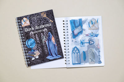
Dark Academia Collection
Scholarly, gothic, and apothecary designs in deep, candlelit palettes.
Browse Collection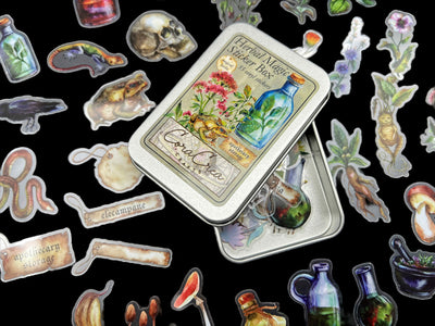
Stickers
Illustrated stickers covering cottagecore, dark academia, and crossover aesthetics.
See All StickersSee also
Happy creating,
More from the Blog

22 June 2026
Cyanotype Journal Pages: Easy Sun Prints, No Drawing

14 June 2026
Pressed Flower Journaling 2026

20 May 2026
ADHD Journaling: How to Build a System That Actually Sticks

14 May 2026
How to Start a Junk Journal in 2026

6 May 2026
Washi Tape vs PET Tape: The Difference

18 April 2026
Mother's Day Stationery Gift Guide 2026: For the Journaler in ...