Poetcore vs Dark Academia:
Which Literary Aesthetic Is Right for Your Journal?
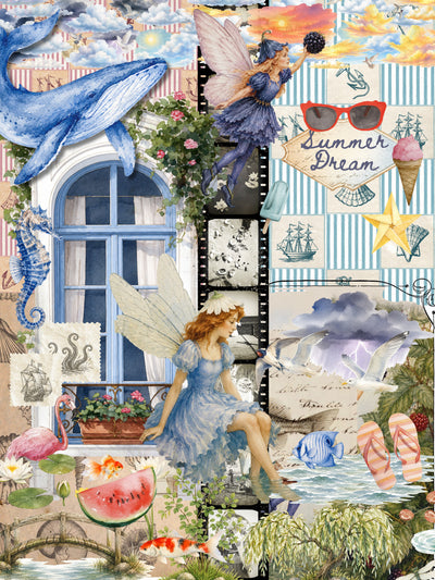
If your Pinterest feed has been filling up with ink-stained notebooks, dried pressed flowers, and poems scrawled in candlelight recently, you are not imagining things. Poetcore has taken off in a big way in 2026, with Pinterest reporting a 175% increase in searches for the aesthetic over the past year. And yet, for many journalers, it still feels fuzzy: how is it actually different from dark academia, which has been everywhere for years?
Both aesthetics are literary. Both are moody. Both reach for old paper and deep colors. But once you sit down and start building a journal page, the differences become clear fast. The color palettes, while sharing a few overlap points, tell very different stories. And the supplies you reach for are not the same at all.
I have been thinking about this one for a while, so I wanted to write it out properly. Here is my full breakdown of both aesthetics, what each one actually looks like in a journal, and which supplies work best for each.

The Burnt Writing Washi Tape Set: manuscript handwriting texture that sits right at the heart of the poetcore aesthetic
 ►
►
What Is Poetcore?

Poetcore is built around the act of writing itself. Not scholarly writing, not academic writing, but personal writing: verse scratched out in margins, fragments of feeling pressed between pages, handwriting that looks like it was never meant to be read by anyone else. It is an aesthetic that treats the journal as a poem waiting to happen.
Visually, the references are soft and intimate. Think dried flowers tucked between pages, candle wax drips at the corner of a letter, crumpled paper that has been smoothed flat again, morning light coming through a dusty window. There is an impermanence to it, a sense that everything shown is in the middle of becoming or fading rather than being perfectly preserved.
The color palette runs warm. Cream, ochre, rust, dusty rose, deep burgundy. The tones have heat in them, as if the pages have spent years sitting in a sunlit room. Lighting in poetcore imagery tends to be golden rather than cool, and textures are soft rather than sharp.
The literary references lean personal and lyrical: Keats, Emily Dickinson, Rupi Kaur, Mary Oliver. The feeling is of someone writing to process something rather than to demonstrate erudition. Poetcore journaling is writing-forward in a way dark academia rarely is. Quotes get annotated. Margins fill up. The page looks like it was used.
One of the things I love about this aesthetic is how it embraces imperfection. Wabi-sabi sits right at the heart of it: a smeared ink line, a slightly uneven border, a flower that has gone a little brown at the edges. These are not mistakes in a poetcore spread. They are the point.

Burnt Writing Washi Tape Set: the singed paper-edge effect is one of the most recognizable visual signatures of poetcore journaling
What Is Dark Academia?
Dark academia arrived as a coherent aesthetic around 2020 and has held steady ever since. Where poetcore is intimate and lyrical, dark academia is grand and institutional. The visual references are large-scale: gothic architecture, candlelit lecture halls, towering library shelves, classical sculptures, anatomical diagrams.
The palette is deeper and cooler. Deep brown, charcoal, forest green, burgundy, with gold accents that catch the light. There is more darkness in dark academia, literally and figuratively. The backgrounds are shadowed. The atmosphere is of evening rather than morning.
The mood is scholarly and serious, with a slight undercurrent of mystery. Dark academia journaling often draws on classical literature, mythology, and the imagery of rigorous study: handwritten annotations in the margins of old texts, manuscript fragments, specimen pages, herbarium labels. Pages in this aesthetic tend to be structured and layered, collage as composition rather than collage as feeling.
If poetcore reads like a personal diary, dark academia reads more like a scholar's notebook: organized, referenced, annotated. There is still personal expression in it, but the framework is intellectual first, emotional second.

Curiosities Box: gothic architecture, specimen diagrams, and classical literature imagery for the scholarly spread
 ►
►
Side by Side: The Key Differences
Once you lay them next to each other, the contrast becomes easier to see. Here is how the two aesthetics compare across the main journaling decisions:
Poetcore
- Warm cream, ochre, rust, dusty rose
- Dried flowers, candle wax, crumpled paper
- Golden, soft morning light
- Aged parchment with warmth
- Writing-forward: quotes, fragments, annotations
- Imperfection as aesthetic (wabi-sabi)
- Personal, lyrical, emotional
- Keats, Dickinson, Rupi Kaur references
Dark Academia
- Deep brown, charcoal, forest green, burgundy
- Manuscripts, diagrams, classical sculpture
- Candlelit, shadowed, evening atmosphere
- Aged parchment with depth
- Structure-forward: collage, layers, composition
- Precision and intentionality
- Scholarly, mysterious, intellectual
- Classical lit, mythology, herbarium labels
The sharpest difference, in my experience, comes down to warmth and intention. Poetcore pages feel like something happened there. Dark academia pages feel like something was built there. Both are beautiful, but they ask different things from you as a journaler.
Color palette is also a quick tell. If you reach for warm ambers and dusty pinks, you are probably building a poetcore page. If you reach for cool darks and deep forest tones, you are most likely working in dark academia territory. The overlap zone sits in aged parchment tones and burgundy, which both aesthetics share.
Poetcore Journaling Supplies
Poetcore journaling is grounded in writing and texture. The supplies that work best are ones that give pages warmth, imperfection, and that handcrafted, intimate feeling.
Paper and Notebooks

Paper is the surface everything else sits on in a poetcore spread, so it is worth choosing carefully. The Revival Tapes Box is a good starting point for building texture and layering: the tape selection works as border material, background overlay, and accent detail depending on how you use it.
For transparent tape that adds detail without covering what is beneath it, the Cathedral Bloom Transparent Tape is exactly right. The botanical and architectural print sits over handwriting cleanly, which is what poetcore pages need: decoration that does not compete with the words. I use it over lines of journaling when I want to add visual texture without obscuring anything I wrote.

Cathedral Bloom Tape Loop: transparent tape that layers over handwriting without covering it
If you want warm, aged paper as your writing surface, the Whispers of the Countryside Rice Paper Pack is exactly right. Rice paper has a softness and texture that holds ink cleanly and photographs well. It has that faded, worn-in quality the aesthetic is built around, and it layers into collage naturally alongside other materials.

Whispers of the Countryside Rice Paper Collection: soft, warm-toned rice paper that suits both poetcore writing and collage
Washi Tape for Texture and Borders

The Afternoon Tea Ephemera Book is packed with layering material: illustrated cards, printed paper cutouts, and background elements with that warm, slightly faded quality the aesthetic works best in. Use single pages as journal backgrounds, tear elements for collage, or press them under tape to build up texture depth. The warm palette translates directly into poetcore spreads without any adjustment needed.

Pair it with the Burnt Writing Washi Tape Set for manuscript text overlays. The handwriting patterns on this set look like poetry fragments and script extracts, which layers beautifully under your own writing. It is one of my favorites for background texture without making a page feel cluttered.

Dream Gold Foil Washi Tape: gold foil washi for warm, literary accent borders
Stickers for the Writing-Forward Look

The Fountain Pens Clear Stickers are perfect for poetcore because they reinforce the writing-forward identity of the aesthetic. Clear sticker film means they sit on the page without blocking what is beneath, so you can layer them over your own handwriting or printed text. They are subtle enough to use generously without overwhelming a spread.
Dark Academia Journaling Supplies
Dark academia journaling rewards layering and structure. The best supplies for this aesthetic are ones that carry weight and specificity, things that feel like they belong to a serious collection rather than a casual notebook.
Sticker Collections

The Academia Peel-Off Labels work well as a dark academia foundation layer. The label format has that catalogued, annotated quality the aesthetic depends on, and they sit flat on the page in a way that feels deliberate rather than decorative. They anchor compositions without overwhelming them, which is exactly what structured, layer-forward dark academia spreads need.

Academia Peel Off Labels: peel-off labels with a catalogued, scholarly quality for dark academia pages
The Apothecary Labels Sticker Tin adds a scholarly, gothic layer that is very specific to dark academia. Apothecary imagery sits right in the academic tradition of natural science and cataloguing, and these labels are detailed enough to look like they came from a real specimen collection. They work brilliantly as page anchors when you want to build a more structured composition.
Ephemera and Layering Materials

The Specimen Ephemera Mysteries of the Night is one of those products that feels made for a specific mood, and that mood is very dark academia. The specimen-style cutouts have the look of natural history collections, and they layer into journal pages in a way that feels researched and purposeful. I love combining them with aged paper backgrounds for that "cabinet of curiosities" spread look.
Finishing Touches

The Writer Collection Premade Wax Seals add an unmistakably literary finishing touch. They work for sealing envelopes tucked into a journal, anchoring a significant page, or simply adding a formal, deliberate accent. The writer-themed designs tie directly into both dark academia and poetcore, which makes them one of the few supplies that works equally well in both aesthetics.

The Lady Forest Stamp brings botanical and literary imagery into dark academia spreads without tipping them toward cottagecore. Botanical illustration has a long tradition in academic settings, and this stamp sits in that tradition: detailed, elegant, and specific enough to anchor a page composition.
Where the Two Aesthetics Overlap

There are three areas where poetcore and dark academia genuinely meet, and they are worth knowing because supplies in these areas can move freely between both aesthetics without looking out of place.
Apothecary and herbalism imagery sits at the crossroads of both. For dark academia, apothecary represents the scholarly cataloguing of the natural world. For poetcore, it carries a more romantic, alchemical quality. Either way, apothecary labels and botanical specimens read as belonging in both worlds.
Old handwriting and manuscript textures work in both aesthetics for different reasons. Dark academia uses them as evidence of study and scholarship. Poetcore uses them as evidence of personal writing and emotional memory. The same aged handwriting washi tape can anchor a dark academia composition or soften a poetcore spread depending on what surrounds it.
Botanical study and nature illustration bridge both aesthetics because the tradition of natural history illustration belongs to both the academic world and the intimate world. Pressed flowers feel poetcore. Botanical diagrams feel dark academia. But a detailed flower illustration drawn in a scientific style sits comfortably in both.
The Mystical Woodlands Sticker Book is a good example of a collection that leans poetcore in feel (forest creatures, soft palette) but can be pulled toward dark academia with the right surrounding materials. Context matters a lot in how these supplies read on the page.
Mixing Both in One Journal

Many of the best journals I have seen do not commit entirely to one aesthetic. And honestly, I think that is the most interesting approach. A journal that moves between poetcore warmth and dark academia depth across different sections has real character.
The key to mixing both without the pages looking muddy is to pick one shared anchor. For most journalers, that anchor is the paper. If you use the same aged parchment paper throughout, both aesthetics read as part of a coherent whole even when the mood shifts between them.
Color is the other place to be deliberate. Burgundy is shared territory: warm enough for poetcore, deep enough for dark academia. Building your color story around burgundy, amber, and deep cream gives you movement between both worlds without jarring transitions.
Where things can start to feel inconsistent is when the writing energy changes. Poetcore pages invite handwriting. Dark academia pages invite structured composition. If you have a spread that is clearly writing-forward sitting next to one that is clearly collage-and-layer, they can feel like they belong to different journals. The fix is usually to add a handwritten element to your dark academia spreads and a structured frame to your poetcore ones, so there is enough common vocabulary that the pages talk to each other.
One practical combination I like: use the Afternoon Tea Ephemera Book pages as the background layer (poetcore energy), the Apothecary Labels on the inside (dark academia energy), and keep the center of the page open for writing. It holds both aesthetics in the same spread without either one taking over.
Start with one aesthetic, expand from there
Most journalers find one of these aesthetics resonates more strongly at first. Start there, build your supply collection around it, and let the other aesthetic enter naturally through the overlap zones.
Build Your Literary Journal
Whether you are drawn to the warm intimacy of poetcore or the scholarly depth of dark academia, the supplies are here.
Poetcore Essentials
Aged paper, manuscript textures, and writing-forward supplies.
Browse suppliesDark Academia Picks
Gothic stickers, specimen ephemera, and scholarly layering materials.
Shop dark academiaQuick answers
I love both aesthetics but have no idea where to start. What do I buy first?
Start with paper. Aged, textured paper works in both, so once you have it as your base you can build outward from there. The Whispers of the Countryside Rice Paper Pack has that warm, worn-page feel that belongs to either world. Pick up one washi tape from each aesthetic and you have what you need to make your first spread without overthinking it.
Do I need completely different supplies for each aesthetic?
Not at all. The overlap is bigger than most people expect. Wax seals work in both. The Burnt Writing Washi Tape Set reads as poetry fragments in a poetcore spread and as aged scholarly text in a dark academia one. The Apothecary Labels Sticker Tin and the specimen ephemera sit comfortably in either world. Where the two really diverge is color: reach for warm ochre and dusty rose on poetcore pages, deep forest green and charcoal for dark academia.
Which single product would you recommend if I could only choose one?
The Burnt Writing Washi Tape Set, without hesitation. I keep coming back to it because it works across both aesthetics without looking out of place. On a poetcore page, the manuscript handwriting patterns feel like poetry fragments layered under your own writing. On a dark academia page, they read as aged scholarly text. It is on probably half my spreads at this point.
 ►
►
Frequently Asked Questions
What is the poetcore aesthetic?
Poetcore is a visual and journaling aesthetic built around the act of personal writing. It draws on imagery of handwritten verse, ink-stained notebooks, dried flowers pressed between pages, candle wax drips, and soft morning light through dusty windows. The color palette runs warm: cream, ochre, rust, dusty rose, and deep burgundy. The mood is intimate and lyrical rather than grand or scholarly, drawing on poets like Keats, Emily Dickinson, and Rupi Kaur. In journaling, poetcore embraces imperfection and writing-forward pages where quotes, fragments, and annotations sit at the center of the spread.
How is poetcore different from dark academia?
The core difference is mood and palette. Poetcore is warm, intimate, and writing-forward, with a lyrical and personal emotional register. Dark academia is cooler, more structured, and built around scholarly and institutional imagery: gothic architecture, manuscript fragments, anatomical diagrams, and classical literature. Color-wise, poetcore reaches for ochre, dusty rose, and warm amber; dark academia reaches for deep brown, charcoal, forest green, and candlelit gold. A poetcore page feels like someone's diary. A dark academia page feels like a scholar's notebook. Both are literary and moody, but they ask different things from your supplies and from you as a journaler.
What supplies do I need to start a poetcore journal?
Start with paper that has warmth and texture: the Whispers of the Countryside Rice Paper Pack and the Revival Tapes Box both give you a warm, layered foundation to build from. Add the Afternoon Tea Ephemera Book for collage elements with that faded, vintage feel, and the Burnt Writing Washi Tape Set for manuscript text overlays. If you want to lean into the writing-forward identity of the aesthetic, the Fountain Pens Clear Stickers layer beautifully over handwriting without obscuring it. From there, the Cathedral Bloom Transparent Tape adds botanical detail, and the wax seals add a personal finishing touch to pages or tucked-in envelopes.
Can you mix poetcore and dark academia in the same journal?
Yes, and it often makes for the most interesting journals. The key is to pick a shared anchor so the pages read as part of the same project. Aged parchment paper works as a consistent background across both aesthetics. Burgundy and warm amber are palette colors that belong to both. Apothecary imagery and old handwriting textures sit comfortably in both worlds. The Writer Collection Wax Seals and the Burnt Writing Washi Tape Set both translate between the two without feeling out of place. Where mixing gets tricky is when the writing energy clashes: poetcore pages are writing-forward, dark academia pages are composition-forward. Adding a handwritten element to your dark academia spreads and a structured frame to your poetcore ones helps the pages talk to each other.
Is poetcore a passing trend, or is it here to stay?
The 175% Pinterest growth figure for 2026 suggests poetcore is in an active peak right now, but the underlying aesthetic has roots that go much deeper than a single trend cycle. Personal poetry, handwritten journals, and the imagery of intimate literary life have been part of creative culture for centuries. What poetcore has done is given a name and a visual shorthand to something journalers have always been drawn to. Aesthetics with that kind of historical depth tend to stabilize into consistent communities rather than disappearing entirely. Dark academia, which had a similar peak moment around 2020, remains active and well-resourced in 2026. Poetcore is likely to follow the same trajectory.
See also
Happy creating,
More from the Blog

22 June 2026
Cyanotype Journal Pages: Easy Sun Prints, No Drawing

14 June 2026
Pressed Flower Journaling 2026

20 May 2026
ADHD Journaling: How to Build a System That Actually Sticks

14 May 2026
How to Start a Junk Journal in 2026

6 May 2026
Washi Tape vs PET Tape: The Difference

18 April 2026
Mother's Day Stationery Gift Guide 2026: For the Journaler in ...