Spring Bullet Journal Setup 2026: Botanicals, Pastels & Dark Florals
By the third week of March, the winter journal starts to look wrong. The dark palette, the heavier textures, the aesthetic built around short days and lamplight. It suited the season. It no longer does. When the light outside changes and the page still reads like January, something is off.
There are three directions a spring setup can go. Each has its own visual logic, its own supply list, and its own character. The botanical path draws from Victorian field guides and nature journaling, keeping things earthy and specific. Pastel cottagecore leans into the soft side of spring: garden warmth, climbing roses, blush and sage. Dark floral carries the drama of winter palettes into the new season by swapping bare branches for deep burgundy roses and midnight blooms.
This guide covers all three, with the specific stationery that makes each one work.
Botanical Spreads: The Pressed-Flower Path
The botanical aesthetic draws from nature journaling and Victorian field guides. The palette is earthy: sage, moss, warm ivory, the occasional amber or dusty rose accent. The imagery runs to specimens, pressed flowers, herb illustrations, and the kind of detail that rewards looking closely. It is slower than the pastel alternative, rooted in scientific naturalism rather than garden romanticism.
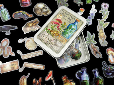
For sticker collections, the style matters as much as the subject matter. The Herbal Magic Sticker Tin ($16) lands in the apothecary register: herbs, dried botanicals, hand-labeled elements. It reads like something extracted from an herbalist's notebook rather than a flower shop. The Specimen Sticker Tin ($16) takes a more scientific direction: pressed specimen imagery that sits close to archival naturalist prints. Both work for botanical spreads; the difference is tone rather than theme.

Wooden stamps add a texture that stickers cannot replicate. A stamped image has slight ink variation, irregular edges, and a physical presence that looks genuinely handmade rather than printed. The Lady of the Forest Wooden Stamp ($12.50) brings a figurative element into a botanical spread without demanding that everything around it be equally detailed. Stamped in brown or forest green on ivory paper, it anchors the page.

The Bees Wooden Stamps ($9.50) add movement and naturalistic detail. Bees fit the botanical world without forcing the page into sweetness. The Orchards Sticker Sheet ($10.50) rounds the section out with fruit and branch imagery that sits between the scientific and the pastoral.

The harder challenge with botanical spreads is keeping them from looking like a collection of individual elements rather than a unified page. The connective tissue is paper and washi. A strip of sage or herb-print washi running along the margin ties everything together without competing with the sticker detail.

Build a Botanical Setup
Herbal and specimen stickers for layering, wooden stamps for figurative detail, orchard stickers for branch and fruit imagery.
Pastel Cottagecore: Soft Garden Spreads
Pastel cottagecore draws from garden aesthetics rather than forests. The palette shifts to blush, lavender, sage, and pale cream. The imagery comes from climbing roses, wildflower paths, and country garden scenes. It is warmer than botanical, more romantic, and softer. If botanical spreads feel like a quiet afternoon with a field guide, pastel cottagecore spreads feel like early morning in the garden before anything gets too warm.
Washi tape is the foundation for this aesthetic. A single strip of botanical-garden tape along a page border changes the register of the whole spread. The Secret Garden Washi Tape ($10) does this with climbing garden imagery in soft, muted tones. It is versatile enough to border tracker pages, frame a weekly spread, or anchor a full mood board.

The Apothecary Flower Washi Tape ($17) sits richer in color and detail, pairing garden botanicals with an apothecary border that prevents the palette from reading as purely pastel. It gives the spread a slightly more complex register than the Secret Garden washi alone.

The Secret Garden Clear Stamp ($12.50) prints delicate garden imagery at the right scale for journaling. It layers easily over washi borders, building up a spread that reads like several decisions rather than a single element applied and repeated.

For a wider botanical range, the Vineyards & Orchards Clear Stamps ($20) add climbing vines and orchard branch details. A slightly more structured take on spring garden imagery that works on pages where you want less obvious floral decoration.


Curiosities Box — Poetic Spring
The current Curiosities Box theme is Poetic Spring: a full set of spring stationery built around this exact aesthetic. If you want the full pastel cottagecore setup in one order, this is the fastest way to get there. $95.00 bimonthly.
See the Curiosities BoxDark Floral: Carrying Mood into Spring
Dark floral is for journalers who don't want to trade drama for softness. The palette stays deep: burgundy, inky purple, deep plum, forest green. The imagery shifts with the season. Roses instead of bare branches, flowering vines instead of stark twig patterns. It reads as spring, but with the atmosphere of winter retained.
The challenge with dark floral is preventing it from looking like the same winter spread with flowers added. The key is contrast: the imagery should be warm and organic (roses, blossoming botanicals, seal motifs), while the background and borders maintain the depth that makes the palette work. A deep burgundy rose on a near-black background reads very differently from the same rose on cream.
The Enchanted Forest Foil Washi Tape ($11) adds a metallic sheen that catches light differently from matte tape. This prevents dark spreads from looking flat. As a border element it shifts the whole page register without competing with the darker elements around it.

The Apothecary Foil Washi ($9.50) brings the apothecary register in the same foil finish. It works as a border accent that holds its own against deep backgrounds where matte tape would disappear.

The Mystical Woodlands Sticker Book ($25) covers the widest range within the dark palette: forest scenes, night-blooming flowers, woodland creatures, and dark botanical imagery drawn in a style that sits firmly in the moody end of the spectrum. For building out a full dark floral spread, it provides the most options per page.

The Apothecary Labels Stamp ($12) prints the vocabulary of old apothecary vessels. Good for pages built around dark botanical science rather than pure decoration. A stamped label on a dark spread signals something was recorded here, not just decorated.

The Orchid Wax Seal Handle ($10) shifts the surface texture entirely. A wax seal pressed into the corner of a dark floral page looks like correspondence from somewhere imaginary. The orchid design bridges botanical and dark aesthetics without strain. It is recognizably floral but carries enough visual weight to belong on a moody page.

Build a Dark Floral Setup
Foil washi for borders that hold their own against dark backgrounds, a wide-range sticker book for layering, and a wax seal for finish.
Spring Spreads to Try
Whether you are starting a new notebook or adding a seasonal section to an existing journal, these spreads give each aesthetic something specific to work toward.
- Pressed-flower mood board: botanical stickers layered on cream or ivory paper with sage washi bordersBotanical
- Plant growth tracker framed with specimen imagery and handwritten latin namesBotanical
- Spring habit tracker with Secret Garden washi borders and floral stamp accentsPastel
- Garden notebook double-spread: one page for observation notes, one for seasonal planningPastel
- Spring reading list with dark floral headers, Mystical Woodlands sticker accents, and apothecary stamp detailsDark Floral
- Poetry spread with deep-plum background, foil washi borders, and a wax seal closing the pageDark Floral
- Foraging log with botanical stamps, handwritten notes on field observations, and a nature sketch sectionBotanical
Three months, three aesthetic paths — same journal.

February — pastel collage, goals and habits
March — dark apothecary, monthly tracker

April — botanical blue, monthly spread
Find the Setup That Fits Your Spring
Start with the collection that matches the aesthetic you are already drawn to.
Botanical Collection
Herbarium stickers, wooden stamps, and naturalist imagery in earthy greens and ivory.
Browse Botanicals
Pastel Cottagecore
Garden washi, cottage flower stamps, and soft spring tones in blush, sage, and cream.
Browse Washi Tapes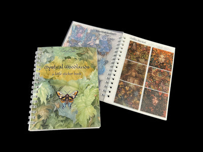
Dark Floral
Moody botanicals, foil washi, and deep palette stickers for dramatic spring spreads.
Browse Dark CollectionsFrequently Asked Questions
When should I switch to a spring bullet journal setup?
Any time after the first week of March is reasonable, but the trigger for most people is a change in light rather than temperature. When you sit down at the journal and the palette looks wrong for the day outside, that is the practical signal. There is no rule that you have to start at the calendar equinox.
Can I mix aesthetics in the same journal?
Yes. The three aesthetics in this guide share enough visual ground that they combine more naturally than it might seem. Botanical and pastel cottagecore overlap in the garden imagery. Dark floral and botanical overlap in the specimen and pressed-flower elements. The risk is mixing the pastel and dark palettes in the same spread, where the color temperature difference creates visual tension. In separate spreads, or across a whole journal, all three work together.
What are the best sticker styles for botanical spreads?
Look for illustration styles that reference scientific naturalism rather than modern cartoon or bright graphic art. Detailed herbarium imagery, specimen drawings, pressed-flower layouts, and vintage botanical prints all read correctly in this aesthetic.
Do I need to redo my whole journal for spring?
No. The most practical approach is a seasonal index page or a dedicated section at the start of a new month. A single spread with a new spring palette establishes the shift without discarding the continuity of the journal that came before it.
How do I keep a dark floral aesthetic from looking too wintery?
Shift the imagery. Replace bare branch and twig elements with flowering vines, rose motifs, and botanical specimens in bloom. The palette can stay as dark as you want, but the flora should signal the season.
See also
Happy planning,
More from the Blog

Apr 18, 2026
Mother's Day Stationery Gift Guide 2026: For the Journaler in ...

Apr 18, 2026
Travel Journal Setup Guide for Beginners | CoraCreaCrafts

Apr 10, 2026
How to Use Wax Seals: A Complete Beginners Guide

Apr 02, 2026
Poetcore Journaling: A Complete Guide for National Poetry Month

Mar 17, 2026
Poetcore vs Dark Academia: Which Aesthetic Is Yours?

Mar 10, 2026
Cottagecore vs Dark Academia: A Supplies Guide for Both Aesthe...